HTMLPanda
HTMLPanda
  • EXPERTISE
    • Development

    • Web Development
    • eCommerce Development
    • Magento
    • Shopify
    • WooCommerce
    • OpenCart
    • Headless
    • Lightspeed
    • Mobile Website
    • Technology

    • WordPress
    • Drupal
    • JavaScript
    • Angular.js
    • React.js
    • Vue.js
    • PHP
    • Laravel
    • codeigniter
    • FullStack
    • Design to code

    • PSD to HTML
    • PSD to WordPress
    • PSD to Magento
    • Sketch to HTML
    • PSD to Email
    • PSD to Drupal
    • PSD to Shopify
    • PSD to OpenCart
    • Figma to HTML
    • Order Now
  • WHO WE CATER

    Who we cater

    • Agencies
    • Startups
    • Enterprise
    SEE WHO TRUST US

    We love partnership & so the coding. See our

    DEVELOPMENT STANDARD
  • WORK

    Our Work

    • Portfolio
    Case Studies
    WordPress Development for Design Agency DOWNLOAD
    Website Redesign for Nonprofit Organization DOWNLOAD
    Website Design for Clothing Company DOWNLOAD
  • ABOUT

    About

    • Testimonials
    • FAQ
    • Contact Us
    What Makes a Successful Website? - WHITEPAPER

    What Makes a Successful Website?

    WHITEPAPER DOWNLOAD
  • BLOG
  • ORDER NOW
Contact us

Download this Case Study now!

Complete the form and your download will start automatically.

  • Please enter your real name
  • Please enter a valid email
Download Now

HTMLPanda Blog > PSD to Email > Tips For A Successful Mobile Friendly Email Campaign

Tips For A Successful Mobile Friendly Email Campaign

January 24, 2020
in PSD to Email
Reading Time: 3 mins read
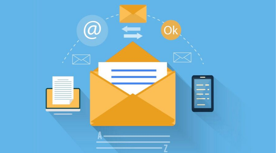
Mobile Friendly Email Campaign

As 68% of email campaigns being opened on a mobile device, So it’s important for every marketer today to rethink their email marketing strategy. In this blog, we’re sharing some top tips for a successful email campaign.

With the skyrocketing usage of mobile in the digital world, marketers have started coming up with mobile-friendly emails. The inclusion of mobile-friendly design in emails leads to clear, legible, and easy to understand the text.

Responsive email templates conversion services help in the formation of emails that look and function great regardless of where consumers access it. As per the stats, 66% of the people read emails on their mobile devices. The number may vary from time to time, but it shows that a considerable portion of subscribers open up the emails you send on their phones.

Table of Contents

Toggle
  • Practical Tips to Follow for a Mobile-Friendly Email-Marketing Campaign
    • Understand Your Audience
    • Use a Clear, Concise and Unique CTA
    • Using single columns
    • Keep the Font Size Little Higher
    • Wise Use of Whitespace
    • Ensure Testing
    • Wrapping it Up:

Practical Tips to Follow for a Mobile-Friendly Email-Marketing Campaign

Understand Your Audience

Before investing time, effort, and money into mobile-marketing design, it is crucial to understand your audiences. You should follow the demographics of customers, their mail-viewing pattern, the type of device they are using to browse emails.

Adobe campaign’s report reveals 69% of consumers who view emails while watching TV, 79% sneak when on vacation, and 3% check in the middle of the night. However, each customer is different, and so are the behavioral patterns associated with them. So, for making your mobile design stand out, it is important to conceptualize the needs of consumers.

Use a Clear, Concise and Unique CTA

To make an email campaign successful, it is essential to be concise both in design and content. Elaborating on mobile is a stupid decision. According to a survey, it has been revealed that respondents prefer short emails that do not distract them.

To keep that in view, all you need to do is design a straightforward CTA that is easy-to-tap. It should be appealing enough to grab and lead customers to purchase something from you. When it comes to placing the CTA, you should try keeping it on the top to make it the most mobile-friendly. It ensures the maximum clickability by making things less complicated. Just make sure to design a CTA that is loud and clear.

Using single columns

When designing an email for mobile, the use of a single column is encouraged. Similarly, three columns should also be avoided. A single-column layout ensures flexibility across email clients and devices. The use of intricate design not only gives an unappealing layout but also distracts consumers, thereby resulting in lesser conversions.

You may also like to read: Most Essential Tricks For Mobile Email Optimization

Keep the Font Size Little Higher

The increase in the size of the font can result in improving comprehension and readability. There are devices such as the iPhone that automatically resize the text, and some enforce people to expand screens and make the font size readable. So, to reduce the extra effort, it is good to keep the font size of 14 pixels for the body and 22 pixels for the header. Another way is to go for em or percent coding that makes the text mobile-friendly.

Wise Use of Whitespace

The structure and appeal of mobile content get accelerated when it is appropriately placed. To give the text some breathing space, you need to use all the whitespaces wisely, and you need to put it around links to occupy the whitespace and make it appear more approachable.

Ensure Testing

The different variations of emails should be tested to ensure accessibility and compatibility on various browsers and devices. The usage of tools like Litmus, Email on Acid, PutsMail is encouraged. With such tools, mails can be viewed across every email client.

Wrapping it Up:

Email campaigning on mobile ain’t complicated. All you need is having the right strategies in hand, analyzing data, understanding your audience to craft a mobile-friendly email campaign.

Consulting a reputed PSD to Email conversion provider can simplify your task by delivering email designs that are consistent, cross-browser and cross-device compatible.

So, take the time out in understanding your emails and then craft a one for mobile use to increase click-through and open rates of your business website.

We would love to here your comments & questions about this blog post. Send us your thoughts by completing the contact form.

Tags: Tips Tricks
Previous Post

PSD to HTML Conversion Features That Keep Your Site Refreshed

Next Post

Learn Everything About Progressive Web Apps

Leave a Reply Cancel reply

Your email address will not be published. Required fields are marked *

Search

No Result
View All Result

LATEST POSTS

  • DevOps trainingDevOps Training: Master Software Development
    June 3, 2025
  • AI-Driven Construction Planning vs Traditional Methods
    May 5, 2025
  • Why SEO Marketing Is More Important Than Ever in 2025
    April 23, 2025
  • The Ultimate Guide to Premium Link Generators in 2025
    March 18, 2025

CATEGORIES

  • Adobe commerce
  • AngularJS Development
  • CodeIgniter
  • Conversion Service
  • Drupal
  • eCommerce
  • Figma Conversion
  • Guide
  • Headless Commerce
  • java script
  • Lightspeed
  • Magento
  • News & Offer
  • News & Offers
  • PHP
  • PSD to Email
  • PSD to HTML
  • PSD to HTML5
  • PSD to Mobile
  • PSD to WordPress
  • Reactjs
  • Shopify
  • Sketch to HTML
  • Vuejs
  • Web Development
  • Website Design
  • WooCommerce
  • WordPress

More

GUIDE

  • The Ultimate Guide to Premium Link Generators in 2025
  • Migration to Magento 2Migration to Magento 2 – A Complete Guide
  • A Guide On JavaScript Website DevelopmentA Guide On JavaScript Website Development
  • ReactJS Web DevelopmentA Complete Guide to ReactJS Web Development
  • Comprehensive Guide to Full Stack Web Development
  • Get in touch with our experts


    Have a Project to Discuss? CONNECT WITH US
    Navigation
    • Contact
    • Portfolio
    • Blog
    • Testimonials
    • FAQ
    • We are Hiring
    • Our Standards
    • Whitepaper
    Service
    • WordPress Development
    • Drupal Development
    • WooCommerce Development
    • Shopify Development
    • Magento Development
    • OpenCart Development
    • Headless Commerce
    • Lightspeed Development
    Get in touch
    1 Lincoln St Boston, MA 02111
    1600 Boston-Providence Highway, Suite#288, Walpole, MA 02081
    H-21, First Floor, Sector 63, Noida, Uttar Pradesh 201301
    Locations We Serve
    • Boston
    • Los Angeles
    • Minneapolis
    • New York
    • Phoenix
    • San Jose
    • Seattle
    • San Francisco
    • Washington D.C
    Referral PartnersNew
    HTMLPanda
    Phone: +1 (857) 242-9910 Email: [email protected] Skype: HTMLPanda
    For Quick Contact Scan the QR code and Say Hi
    qr code
    • © HTMLPanda 2024
    • DMCA Protected
    • Disclaimer
    • Policy
    • Terms
    • Sitemap
    contact us
     

    Looking for a web development partner?

    Request a FREE Quote.

    Connect expert